12 checkout mistakes costing you sales (and what research says you should fix)
Overview of Contents
Amazon patented 1-Click ordering in 1999. The promise was simple - store the buyer's details, hit one button, order placed.
But somehow, three decades later, buying a pair of socks online could still require the stamina of a security clearance.
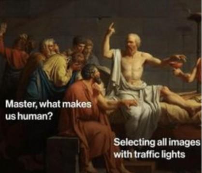
Create an account. Invent a password with a capital letter, a number, and a symbol you'll forget in ten minutes. Verify your email. Pick out the traffic lights in a captcha. Re-type your address, as the form does not accept the way you wrote your apartment number. Then, finally, discover that shipping costs more than the socks. By the last step (hopefully), your shopper is staring into the void, reconsidering the socks and their life choices.
That’s how checkout friction becomes the silent killer of your conversions. You spend endless time and ad dollars perfecting your targeting, photography, and product copy, only to watch all that momentum evaporate in the final 30 seconds.
Research puts real numbers to the problem. Baymard Institute found that 40% of US shoppers who abandoned a cart cited extra costs, while 18% cited being forced to create an account. And those are only two of the friction points researchers have identified across checkout journeys.
Drawing on usability benchmarks, shopper surveys, and real-world retailer experiments, we'll unpack the checkout mistakes costing merchants sales, along with the fixes backed by evidence.
Mistake 1 - revealing unexpected costs too late
According to a Baymard study 40% of shoppers abandon checkout due to unexpected extra fee. And according to a McKinsey study, more than 90 percent of consumers say they are likely to abandon an online purchase if they learn it will involve high shipping costs.
A Shopify merchant on Reddit shared a simple fix:
“Tried a small mobile tweak: put the actual shipping cost + delivery window inside the cart drawer and a tiny ‘estimated total (item+ship+tax)’ box on the PDP.”
The merchant kept the free-shipping banner, reported fewer checkout drop-offs, and saw fewer shoppers leaving to figure out shipping costs. Fewer abandoned carts can also mean less money spent trying to win those shoppers back through cart-recovery emails.
See, a $6.99 shipping fee can be perfectly reasonable but discovering it after entering your details and committing to the purchase is another story, especially when unexpected costs are among the biggest reasons shoppers abandon carts. Show shipping estimates early, explain additional fees, and keep a running total visible.
Mistake 2 - offering delivery options that leave shoppers guessing
66% of US shoppers said they abandon purchases when the delivery offering fails to meet expectations, according to DHL's 2026 US research. And Baymard found that 48% of benchmarked sites fail to show delivery dates.
The problem with labels like “express” is that they describe the shipping service, without giving shoppers a clear arrival date. A standard Amazon order might arrive in three or four days, while a custom sofa could take six to eight weeks. Those are wildly different timelines, yet a vague promise of speed leaves the buyer guessing.
For your holiday season, that additional clarity can help increase the odds for your next sale. Give shoppers realistic delivery dates based on processing time, carrier performance, and seasonal cutoffs. Show the cost of each option, and offer alternatives such as pickup where your fulfillment network supports them.
A fast delivery promise can win the order, but a credible one can save your support team from explaining why the Christmas gift arrived after Christmas.
Mistake 3 - Missing digital wallets or preferred payment methods
A June 2026 PYMNTS Intelligence and PayPal survey estimated that nearly 56 million US consumers, or 21%, had abandoned a cart in the previous month because their preferred payment method was unavailable. Separately, Stripe's analysis of nearly 20,000 B2C businesses found that digital wallets cut average mobile checkout time in half.
Case in point - in 2018, footwear company Wolverine Worldwide faced a familiar ecommerce problem. Its brands attracted plenty of mobile traffic, but those visits were producing fewer orders than the company wanted. The solution involved letting shoppers pay with Apple Pay across its portfolio of brands.
The rollout reduced checkout fields by up to 75% and increased overall mobile conversion by 19%.
Think about what that removes from a limited phone checkout - the card-number hunt, the expiry date, the security code, and the little dance between your shopping app and banking app. The product has already won the shopper over.
But digital wallets are one part of the answer, the broader lesson is about offering the methods your customers already trust.
Look at your payment data by device and order value. Which methods do customers actually select? Where do payment attempts fail? Can a mobile shopper reach the relevant wallet quickly? Use those answers to decide which options deserve prominence, then test whether the change improves completed purchases.
Mistake 4 - forcing shoppers to create an account
Baymard's research found that 18% of US shoppers who abandoned a cart cited forced account creation and that 62% of sites fail to make guest checkout the most prominent option.
And the story, famously known as The $300 Million Button illustrates what that can cost in practice. A retailer simply wanted customers to log in or register before buying. But returning customers had forgotten their passwords. And new customers were wary of registering with a retailer they might never visit again. Some ended up creating multiple accounts. Others gave up halfway through the password-reset process, which is a rather avoidable way to lose someone who has already filled a shopping cart.
Customer accounts have genuine value. But let them check out as guests, then offer to create an account after the order is confirmed. Their email, shipping details, and purchase history can help make that invitation to create an account relevant.
Mistake 5 - making checkout feel like a census
An average US checkout displays 23.48 form elements by default, according to Baymard Institute. Its usability testing suggests that a streamlined checkout can work with as few as 12 to 14 elements. That's a lot of extra typing between a shopper and their T-shirt.
Your own checkout flow could have a curious habit of collecting information for every department in the company. Your fulfillment team needs an address. Your CRM wants a phone number. Marketing would quite like a birthday. Somewhere, a field asking for the customer's company name has survived three redesigns despite selling nothing to businesses.
So audit your checkout field by field. Can shoppers copy their shipping address into the billing address? Can optional details wait until after payment? Does every field help process the order, or is it there because someone once thought the data might come in handy in some distant future?
Every field must earn its place.
Mistake 6 - treating mobile checkout like desktop squeezed into a phone
During the 2025 holiday season, Mobile led checkout drive 57.5% of Cyber Monday sales and 61.6% of Thanksgiving. Baymard's 2025 benchmark found 63% of mobile-site checkouts performed at a mediocre or worse level. Together, these show both the scale of mobile shopping and the opportunity to improve the experience.
And clothing retailer Hush experienced it firsthand. They had twice as many sessions on mobile as on desktop, yet mobile revenue lagged.
When the retailer examined how shoppers moved through its mobile checkout, the journey looked messy. People revisited the delivery page, tapped elements that did nothing, and appeared to struggle with entering delivery details.
Hush then simplified the mobile layout, kept the order summary accessible, clarified form fields, and made delivery options easier to navigate. The result was a projected £68,000 in additional annual revenue.
Your mobile checkout deserves its own inspection. Try completing an order with one thumb while the keyboard occupies half the screen. Check whether the total stays visible, buttons are easy to tap, error messages appear where shoppers need them, and the on-screen keyboard leaves the active field and next button in view.
Basically think about a customer trying to checkout on a phone, possibly with three other tabs open,15 notifications, and 4% battery remaining.
Mistake 7 - making shoppers fight with their own addresses
An address field can turn an ordinary checkout into a test of patience.
You enter your street name. The form changes it. You add your apartment number, and the field rejects it. The address suggestion insists your building exists under a different name, perhaps in a parallel universe where the postal service has better databases.
Google has some rather compelling evidence for letting browsers do the typing. The Chrome team analyzed thousands of address and payment forms across millions of page loads on popular US websites. It found that people who used autofill completed forms 35% faster and abandoned them 75% less often on average, compared with people who typed everything manually.
Make autofill work properly by using standard field labels for street address, city, state, and ZIP code. Keep the apartment or suite field behind an optional “Add apartment or suite” link. And when an address suggestion gets it wrong, let shoppers edit the details or enter their address manually. Your checkout should help get the package to the right door, not make customers prove to a computer that their home exists.
Mistake 8 - turning the promo-code box into an escape hatch
A shopper is halfway through checkout when they spot three innocent words - Enter promo code.
Now a new thought enters the room. What if there’s a better price somewhere?
During one usability test, researchers found that 70% of ecommerce sites have promo-code fields, and 35% display them by default.
A shopper checking out at Crowd Cow saw the coupon field and left the site to search Google for a code. The research stated,
“In the worst cases (in terms of disruption for users) a handful of participants left the site to search for promo codes. In practice, as soon as users have left the checkout to go look for coupons, the chance of them not returning to complete the purchase increases significantly.”
Tuck the field behind a discreet “Have a promo code?” link, automatically apply eligible discounts, and make invalid-code messages useful. Or auto-suggest some promo-codes so the shopper doesn't go outside, but decides between the options they care about.
Mistake 9 - using fake urgency to force a purchase
Fake urgency can backfire spectacularly. In a 2026 survey by Figma, only 18% of everyday US shoppers said countdown timers made them buy faster. Meanwhile, 33% said these timers made a website feel suspicious, while 23% said they prompted them to leave the page or abandon their cart.
The FTC regularly warns about these dark patterns, including countdown clocks that reset after expiring and limited-time claims without meaningful deadlines. They manufacture pressure by making shoppers believe an opportunity is about to disappear.
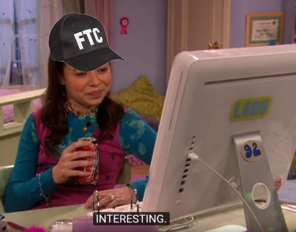
For holiday promotions, use real deadlines. If an offer expires at midnight or orders must be placed by a particular date for Christmas delivery, say so clearly and honor that cutoff.
Mistake 10 - selling inventory that is out of stock
Few things make a store look less organized than proudly accepting payment for a product that vanished from the warehouse yesterday.
The problem tends to surface during peak shopping periods, when your website, physical stores, marketplaces, and fulfillment systems can all have slightly different ideas about what's available.
According to DHL's 2026 shopper research, 68% of shoppers said they had abandoned purchases because products were out of stock or unavailable.
So, keep inventory synchronized across sales channels, reserve stock appropriately during checkout, and make backorders or preorder dates explicit.
And remember, a clear sold-out message may lose one sale today. It’s still better than taking money for an unavailable gift that can create a refund, a support ticket, a chargeback, and a customer who remembers the experience long after the product returns.
Mistake 11 - hiding the returns policy until after the sale
Your customer is considering a $120 jacket. The fit looks promising and the price is within their budget. There is one small pickle - what happens if it arrives and looks like a traffic cone? If answering that means scrolling to the footer, finding a policy page, and deciphering a paragraph written in dense legal jargon, it makes the purchase harder to justify.
A 2025 survey found that almost half of the buyers said a retailer's return policy had influenced whether they completed a purchase.
Put a plain-language summary where shoppers make the decision. State the return window, who pays return shipping, any important exclusions, restocking fees, and how refunds are handled.
Mistake 12 - making checkout feel suspicious
Your store might be perfectly legitimate. But there might be a shopper who has never heard of it until now.
A survey of US adults found that 69% check customer reviews when evaluating unfamiliar online retailers, while 65% look for secure payment options. So trust has to be earned, and a padlock icon can only do so much of the heavy lifting.
It gets more complicated when shoppers consider what happens after the purchase, especially when the anxiety is regarding what happens when something goes wrong with an expensive purchase.
Sennheiser offers a compelling example of what product protection can add to a purchase. After partnering with SureBright, the legacy audio brand recorded protection-plan attach rates of 28% to 31%, alongside a 26% year-over-year reduction in category returns and a 2% increase in average order value. That's an additional revenue stream for the merchant and an extra layer of reassurance for customers buying premium headphones.
With providers like SureBright, you can integrate protection plans natively into your checkout flow. When Sennheiser introduced SureBright plans tailored to their store layout, it didn't feel like a pushy upsell, it felt like good customer service.
Want to see what this looks like for your business? Use our warranty revenue calculator to see how much additional revenue product protection could generate for your store.

Author
Muskan Banga
Muskan is a content writer in the warranties and product protection industry, focused on demystifying and simplifying the industry for both her readers and herself. Her process begins with deep research, weaving in real-world examples to make complex ideas feel accessible and relatable. In her spare time, she obsessively devours Substack newsletters and books while losing herself in art films.